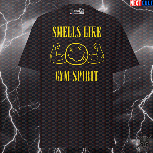

Gym Grunge: Nirvana Stickers for Racks, Bottles and Training Spaces
UPLIFT IRON CLUBWhy Nirvana Grunge Works Better as Gym Décor Than a Theme

A home gym usually starts as a practical room: rack, bench, plates, floor, maybe a fan if you are lucky. The personality arrives later. That is exactly where small grunge details work. Nirvana's visual world was never about polished symmetry or a perfectly coordinated lifestyle set. The appeal was rough edges, worn textures, hand-made energy and a refusal to look too finished. A training space already has many of those qualities naturally.
That does not mean turning the room into a replica music venue. The better move is restraint. One or two stickers on a rack upright, bottle, storage cabinet or chalk box can make the space feel owned without competing with the equipment. The point is not to hide a power rack under graphics; it is to give the anonymous black steel a little identity.
This is also why sticker-sized references make more sense than giant wall treatments for many lifters. They are cheap to move, easy to replace and visually small enough that the gym still reads as a gym. If your taste changes, the whole room does not need a redesign. If the sticker gets scuffed, that can actually suit the grunge aesthetic rather than ruining it.
Nirvana is especially suited to that approach because the band's imagery is already associated with photocopied flyers, battered guitars, rehearsal rooms and imperfect surfaces. The official catalog still centers the band's early-1990s identity, while live photography from the period is full of worn stages, amps and unpolished clothing. In a garage or basement gym, that visual language feels less imported than glossy décor would.
The Rack Is the Obvious Canvas—But Use the Dead Space

A power rack gives you plenty of metal, but not every inch is a good sticker location. The safest rule is simple: decorate dead space, not contact points. Avoid holes that take pins, surfaces where J-cups slide, areas where spotter arms mount, pull-up grips, cable paths and anything that repeatedly touches a barbell. A sticker should not become an equipment problem.
The best locations are usually flat sections of an upright or crossmember that stay out of the way during normal setup. On a six-post rack, rear storage uprights often offer more decorative room than the working front posts. A logo plate or non-contact side face can also work if it does not cover safety markings or numbering you actually use.
Think about sight lines as well. A sticker placed at chest or eye height is visible without taking over the room. One small design near the top and another lower down can look intentional; covering every available surface quickly starts to resemble a luggage case at an airport. Grunge is not the same thing as visual noise.
Before applying anything, clean the surface and let it dry. Chalk dust, skin oil and garage grime are not great adhesive partners. If your rack has a textured powder coat, adhesion can vary, so test a less important spot first. And if the equipment is rented, borrowed or something you plan to resell, use the bottle or storage-bin route instead. Personalization is fun; explaining adhesive residue to the next owner is less fun.

Water Bottles Are the Lowest-Risk Place to Go Full Grunge

If you want the easiest place to use a Nirvana-inspired gym sticker, the water bottle wins. It is personal, portable and completely separate from the equipment's mechanical function. A plain stainless bottle also gives the artwork enough contrast to look deliberate rather than lost in a busy room.
The practical advantage is that you can be more expressive here. A rack may only need one small graphic, while a bottle can carry several references without affecting training. Song-title jokes, weight-plate parodies, grunge typography and smiley-inspired lifting designs can coexist because the object is already meant to travel with you.
Placement still matters. Keep stickers away from threaded lids, flexible seams and areas your hand constantly grips. A smooth central section is easiest to clean and least likely to catch on a bottle cage or bag. If the bottle goes through a dishwasher, check the sticker and bottle-care instructions first; repeated heat and aggressive detergents can shorten the life of adhesives and printed finishes. Hand washing the decorated exterior is the safer default.
There is also a useful social benefit: bottles get mixed up. In a commercial gym, a distinctive sticker makes yours instantly recognizable among ten black insulated bottles sitting near the dumbbell rack. In a home gym, it becomes a small piece of the room's identity that can move with you to outdoor sessions, work or travel.
For this particular collection, the bottle is where the more obvious Nirvana references make the most sense. You can let the joke be visible without forcing the entire training space into one theme.

Storage Cabinets, Plate Shelves and Chalk Boxes Reward Smaller Stickers

Storage is where home gyms often become visually messy: belts, collars, straps, fractional plates, bands, chalk and handles all compete for a place. Stickers can help here when they act like accents rather than camouflage. A small grunge graphic on a drawer front or storage cabinet gives the area character while leaving the equipment itself easy to identify.
Plate shelves and modular storage units are similar. Put decoration on the frame or a blank panel, not on the part that plates scrape across. Bumper plates, kettlebells and medicine balls are heavy enough to destroy a badly placed sticker quickly. The same logic applies to chalk boxes and small accessory bins: choose a clean, flat face that is not repeatedly rubbed by hands or hardware.
There is a nice design contrast in pairing organized storage with rougher artwork. The room can be functionally tidy while still looking less sterile. That is probably the sweet spot for most home gyms. You want the belt where you can find it, the collars in one place and the plates off the floor—but there is no rule saying the cabinet has to look like office furniture.
If you use multiple stickers, repeat one visual idea instead of every possible one. Black-and-white designs, muted colors or a consistent grunge family create cohesion. Three unrelated bright graphics on three adjacent drawers can turn the storage area into the visual focal point, which is rarely what you want. Let the rack, plates and training remain the main event.
And keep labels functional. If a drawer already says bands, straps or cable attachments, do not cover the useful information for the sake of decoration. A good gym setup should get easier to use as it becomes more personal, not harder.

How to Keep the Room Personal Without Making It Look Cluttered

The fastest way to ruin a good home-gym aesthetic is to treat every empty surface as a problem that needs filling. Leave space. A few deliberate details read as personality; dozens of competing graphics read as inventory. This matters even more in small rooms, where racks, dumbbells, plates and cable attachments already create a lot of visual density.
A simple rule is to pick three zones: one primary equipment accent, one portable object and one storage accent. That could mean a rack upright, your water bottle and a cabinet. Stop there for a week. If the room still feels too plain, add one more piece. Building the look slowly is much easier than peeling back a wall of impulse decisions.
Color control helps. Most home gyms are dominated by black, gray and steel, which gives grunge artwork an easy background. White, muted yellow, red or distressed monochrome details tend to stand out without fighting every bumper plate color in the room. If your equipment is already bright, choose quieter stickers so the room does not become a competition between the décor and the gear.
Scale matters too. Large stickers belong on large blank surfaces; tiny ones work better near handles, bottle bodies and accessory boxes. Avoid placing several medium graphics at exactly the same height around the room, which can create a strange visual stripe. Variation looks more natural.
Most importantly, do not confuse a worn-in look with neglect. Chalk on the floor and rust on a bar are not décor. Clean equipment, maintained cables and organized plates can coexist with distressed artwork. The best version of gym grunge is controlled: the space looks used because you train there, not because maintenance lost a fight with nostalgia.
Choose the Sticker for the Object, Not Just the Nirvana Reference

The best design is not automatically the one with the most recognizable reference. Match the artwork to where it will live. A weight-plate parody makes immediate sense on a plate tree or storage cabinet. A kettlebell-grunge design fits near functional-fitness gear. A song-title lifting joke is better on a bottle or laptop, where people can actually read it up close.
That approach also keeps the room from becoming repetitive. If every object uses the same album-inspired motif, the joke gets old quickly. Mix direct grunge references with gym-specific imagery—plates, kettlebells, lifting language and training humor—so the collection feels connected without looking copied and pasted.
For durability, prioritize the surfaces you touch least and the objects you are comfortable decorating permanently. If you are unsure, start with the bottle. It gives you the clearest preview of how the artwork looks in real life without committing to the rack. From there, move to storage or equipment only if the visual style actually improves the room.
The bigger idea is simple: home gyms are personal spaces. They do not need to imitate commercial facilities, influencer studios or equipment catalogs. The rack can be scratched, the plates can be mismatched and the playlist can be loud. A few Nirvana-inspired stickers fit that reality because they add identity without pretending decoration is the point of the room.
Training still comes first. If a sticker makes you smile while you load the bar, helps you recognize your bottle or makes the garage feel more like your own place, it has done its job. Grunge was never about perfection. Your gym does not need to be either.
One more practical filter is readability. Detailed artwork can look excellent on a laptop but turn into visual mush on a small three-inch sticker viewed from across the room. For a rack or cabinet, stronger silhouettes and simpler high-contrast shapes usually survive distance better. Save the finer joke or text-heavy design for the bottle, where it will be seen close up. You can also mock up the placement with a piece of paper before committing: cut it roughly to size, tape it in place and look at the room from the doorway, bench and rack. That thirty-second test tells you more about scale than staring at a product image on a phone.

Heavy metal and rock-inspired gym shirts and workout gear for lifters who train loud.
EXPLORE COLLECTION